57i
Bach
David Lance Goines on the Poster
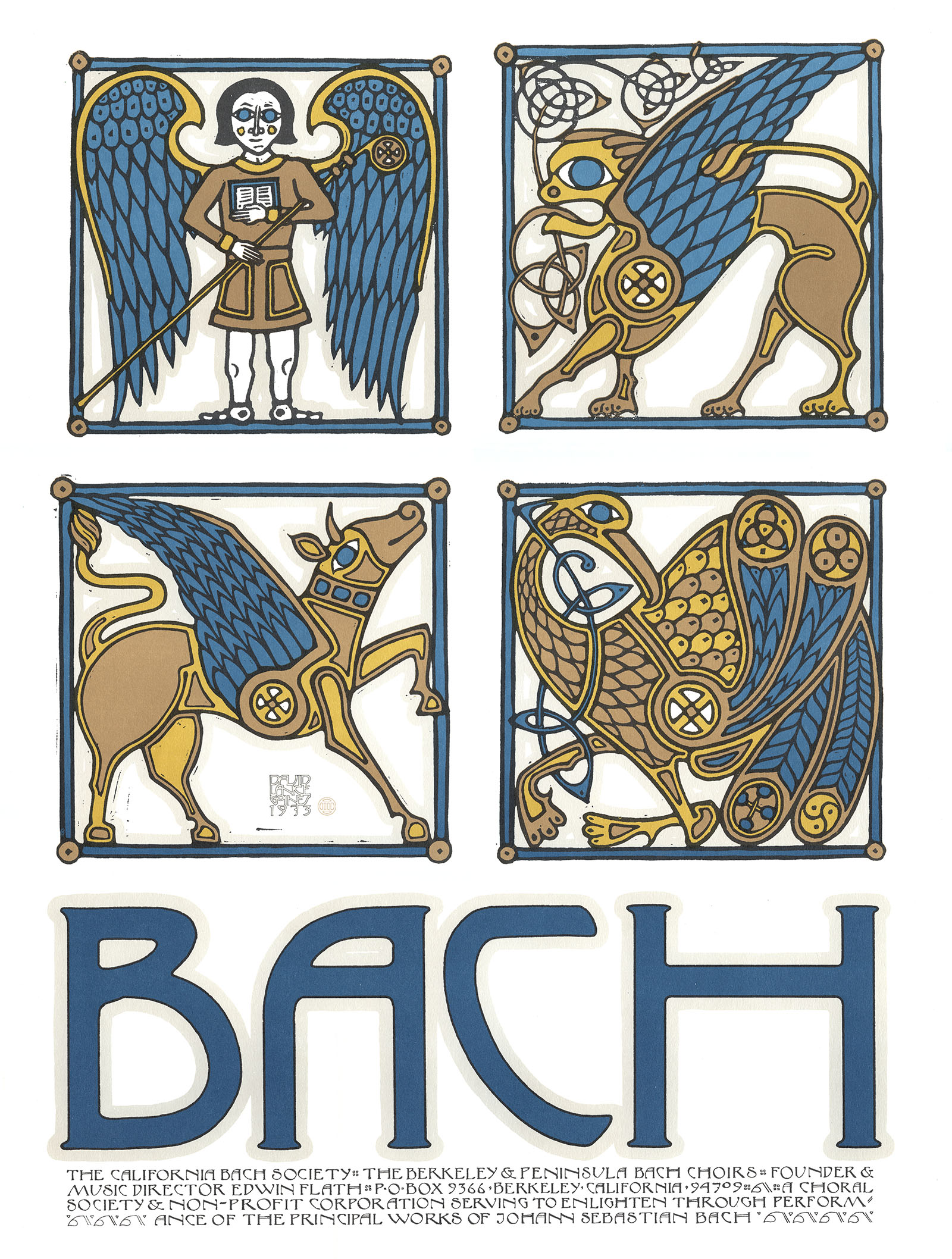
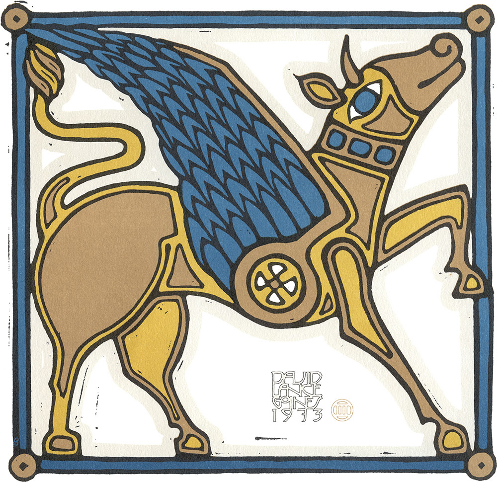
Goines first printed this poster for his friend Tom Luddy and the Pacific Film Archive to advertise a showing of the film Chronik der Anna Magdalena Bach in 1973. Long after the movie finished playing, Goines changed the text and the poster became a general publicity piece for the San Francisco-based California Bach Society.1 It is perhaps his most popular poster, going through no less than three printings. Here is detail from the third printing:
Like many of his late-1960s Bay-area contemporaries, Goines was influenced by the German Jugendstil movement, especially Lucian Bernhard and Ludwig Hohlwein.2 Unlike most of the psychedelic designers, however, he pared his designs down to only the most relavent elements: a strong central image, limited use of color, and a straightforward message. Anything more he felt was no longer a poster.
Although Goines graphic style is most often described as Arts and Crafts, he draws on a wide range historical styles including Japanese ukio-e woodblocks, Art Nouveau, Vienna Secession and Art Deco. His Bach poster, for example, is influenced by Celtic stonework and the Book of Kells to characterize the composer as the "fifth evangelist."
No. 27. Goines Posters, 1973
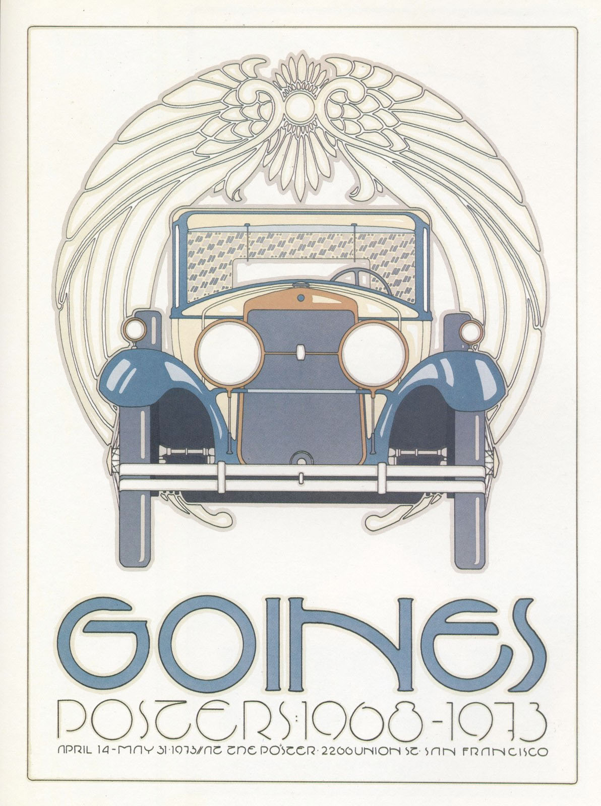
A Catalog of Posters, 1973 3
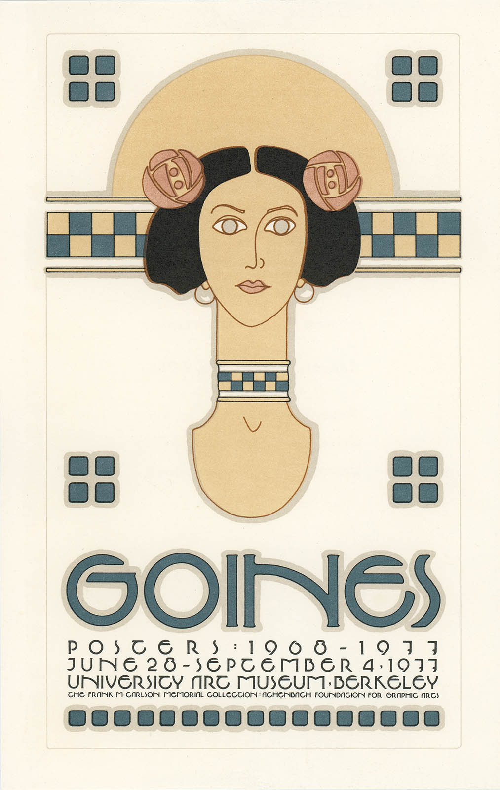
Poster Exhibition, 1977
What separates Goines from other designers, of course, is that he prints his own work. His posters are all 2-24 solid-color lithographs printed on the same press he learned his trade on in the 1960s.5 It goes with saying that 4-color reproductions in books or the images presented here hardly do the originals justice.
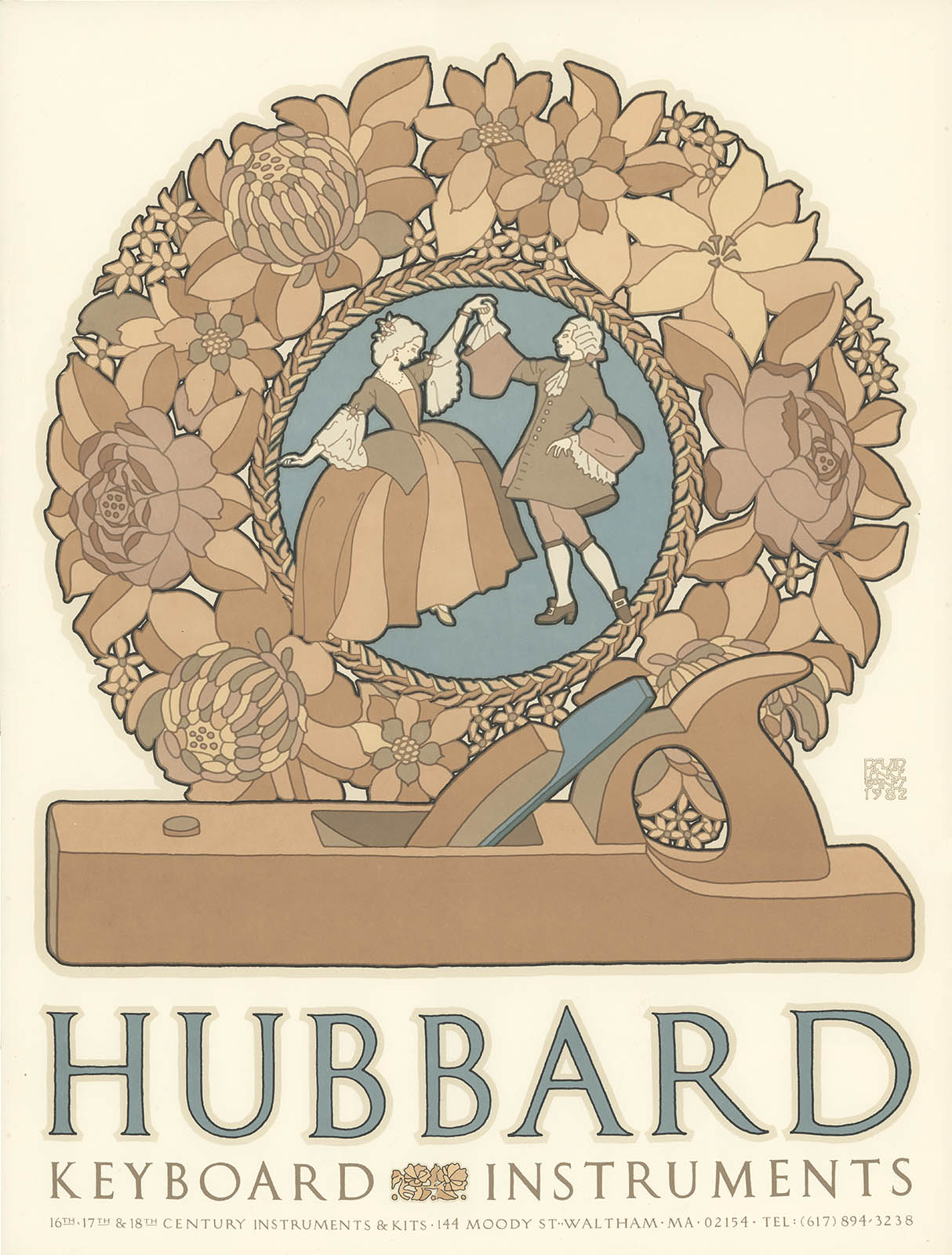
No. 100. Hubbard Instruments, 1982
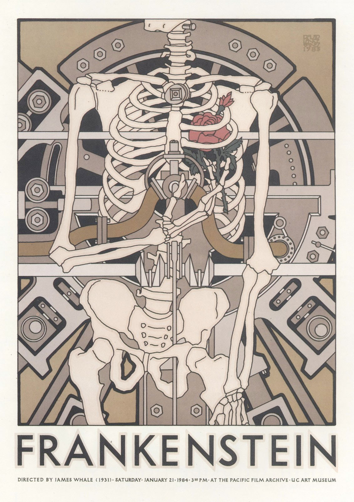
No. 107. Frankenstein, 1983
Over his career Goines has printed some 230 posters. His clients are mostly local and often his friends, or as he stated in a 1999 interview: “...for an audience of people who are somewhat the same as me and the client.”
Today, some forty years after founding the Saint Hieronymus Press, Goines is still designing and printing posters, and still with the same high standards. As Meggs stated in A History of Graphic Design; “...it is possible for the individual artist or craftsman to define a personal direction and operate as an independent creative force with total control over his or her work.” By acting the very anthesis of the rock-star designer he has quietly become a rock-star designer.
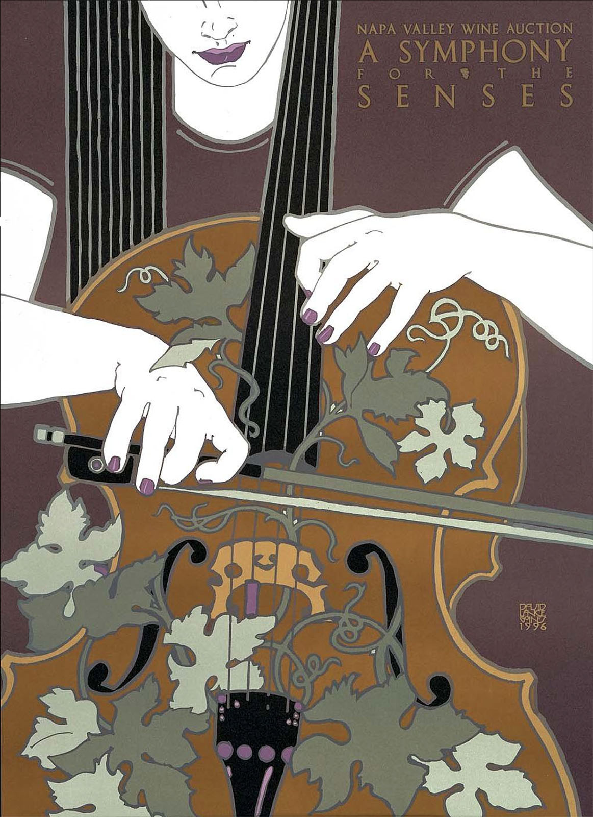
No. 167. Napa Valley Wine Auction, 1996 6
1. This poster is still available from the California Bach Society. For around 30 USD you not only get an actual Goines-printed poster but help support the Society. Your humble narrator has seen cheap 4-color offset reproductions sell for more.
2. Between 16 Nov – 9 Dec 1965, the UC Berkeley University Art gallery held the exhibition Jugendstil and Expressionism in Germany Posters, curated by Herschel B. Chipp. The exhibit was immediately influential with the entire SF underground design community. As Goines recounts: “the very next posters were all but direct imitations of those of the Jugendstil, particularly reflecting the lettering of Ferdinand Andrei and Leopold Forstner of the Wiener Werkstätte.“
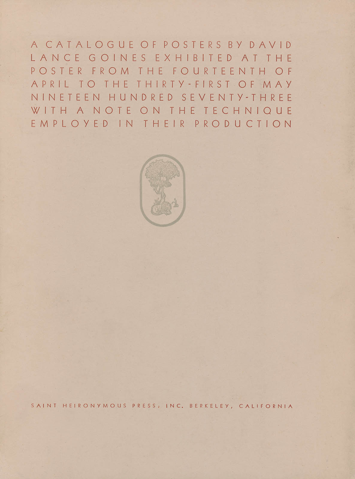
3. For Goines first major exhibition at the Poster in San Francisco he printed the promotional poster (no. 27) and the exhibition catalog Catalogue of Posters By David Lance Goines Exhibited at the Poster From the Fourteenth of April to the Thirty-First of May Ninteen Hundred Seventy-Three With a Note on the Technique Employed in Their Production. (Berkeley: Saint Hieronymus Press, 1973). The book, printed in a single edition of 2000 copies, included small lithographs of his first 27 posters. They were printed with the same inks on book weights of the same paper. Of all the Goines poster books this is the one to get.
4. Here is the back of the card:
5. A 1954 Solna Chief 18×24" photo-offset lithographic press. As Goines states: “It has been in my shop since 1966. and was old and beat up when I got it. My learning to print on it didn’t do much good, either.”
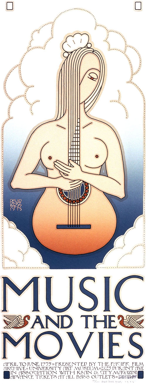
6. A women’s hair as a fret board – a classic Goines design. Here is the theme from a 1975 poster for the Pacific film Archive:
12 Feb 2010, updated 18 Jul 2012 ‧ Design