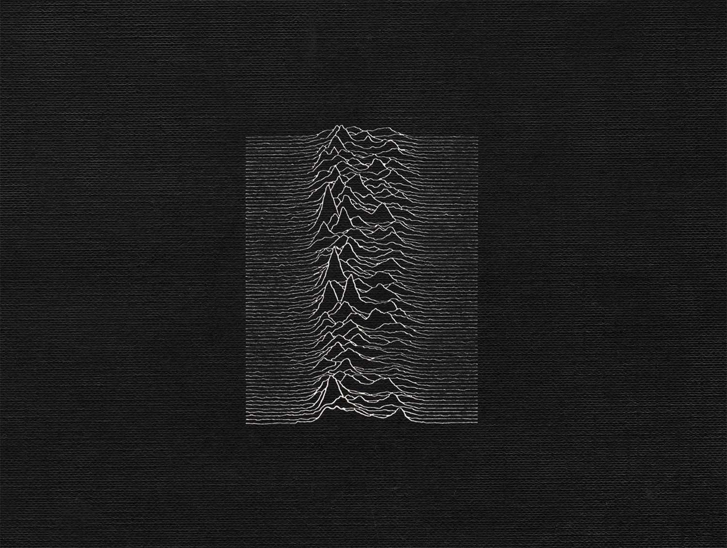
Detail, FACT 10, Unknown Pleasures, Jun 1979
95
Unknown Pleasures
Peter Saville and Factory Records
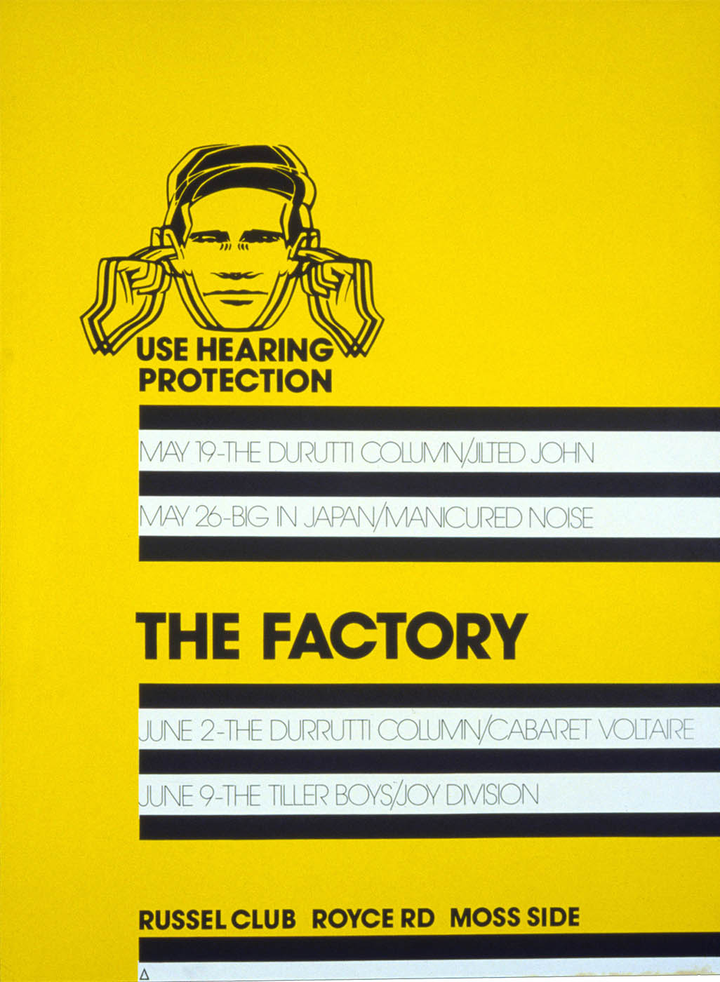
Peter Saville was born in Manchester on 9 Oct 1955 and later studied graphic design at Manchester Polytechnic. After meeting the Grenada TV presenter Tony Wilson at a “very, very bad Patti Smith gig in late 77 or early 78,” he was commissioned, at age 23, to design a poster for Wilson’s new club - The Factory.
FAC 1, The Factory, 1978
The poster, which in typical Saville fashion arrived too late, was not based on the prevailing punk aesthetic but on Jan Tschichold’s Die Neue Typographie. As he later stated “I found Tschichold’s elegantly ordered aesthetic more appealing than the anarchic style of punk graphics. I found a parallel in it for the New Wave that was evolving out of Punk.“
In 1978 Wilson, along with Saville, unemployed actor Tony Erasmus, producer Martin Hannett and band manager Rob Gretton created Factory Records. The chaotic, quixotic and now legendary label set up operations in Erasmus’ home on Palantine Road in Manchester. Because no one had any idea what they were doing, Saville was given a remarkably wide latitude in design. For their first single (a double 7" packaged like a cheap Indonesian import) he directly echoed his earlier poster:
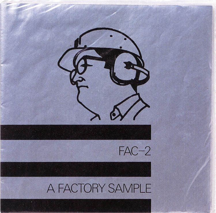
FAC 2, A Factory Sample, 19781,2
For Joy Division’s first album, Unknown Pleasures, Saville placed a small scientific graphic chosen by the band on an expensive textured paper cover (above). The back cover included simply an empty track listing. The minimalist design broke every known album cover design rule. There was no picture of the band - not even their name on the front - but in retrospect there could be no other cover for this music. After finally listening to the tracks Saville realized that "at that moment everything would change."3
In what would be a recurrent design strategy, Saville tied the theme to Joy Division’s first single:
FAC 13, Transmission, Nov 1979
By this time Saville was in London working for Virgin’s Dindisc and freelancing for bands such as Brian Eno, Roxy Music, Ultravox, even Wham(!). He always stated, however, that his work for Factory gave him the most freedom and allowed him to design what he was currently interested in. Over the next six years he essentially appropriated and repurposed the entire history of graphic design. The covers were more about him then they were about the bands.
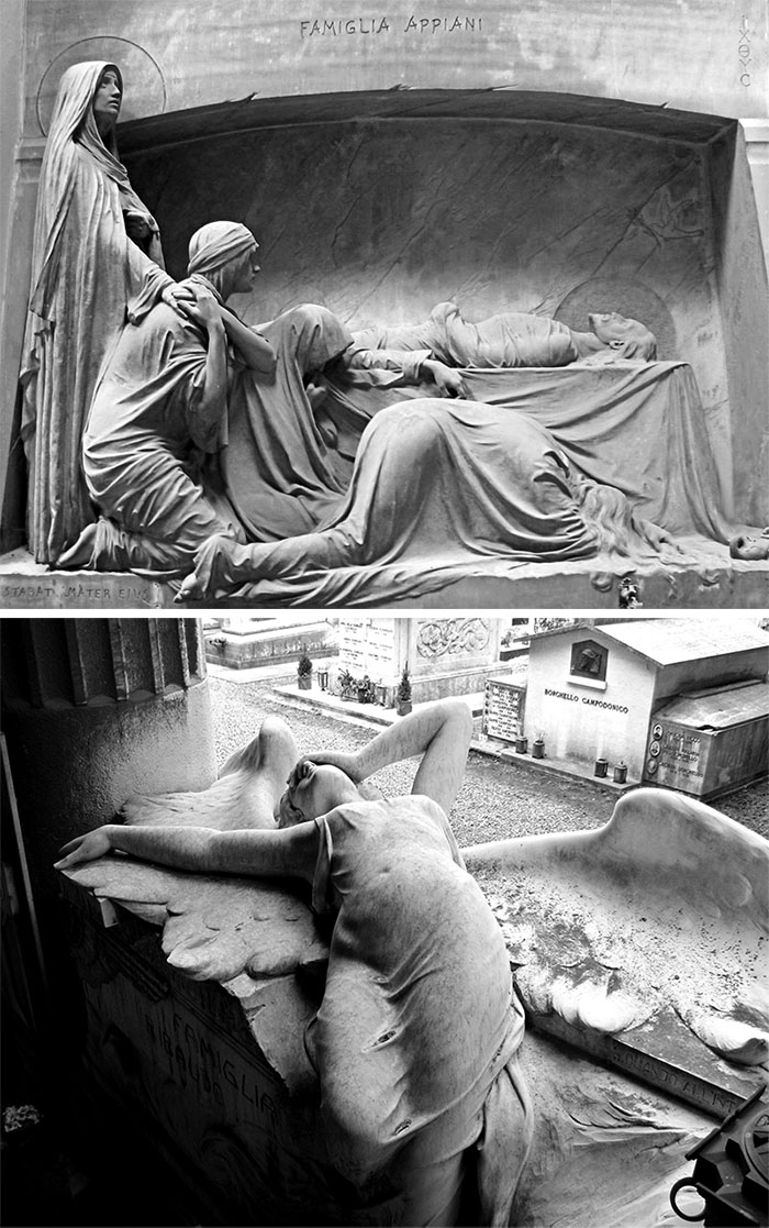
For Joy Division’s second album Saville created a neoclassical sleeve that would evoke a piece of antiquity housing a modern object (an LP – remember these were still considered modern in 1980). He chose a photograph by Bernard Pierre Wolff of the Appieni tomb in the Cimitero monumentale di Staglieno and lettered the cover with Roman lapidary.4 Tragically, it would be a little too prescient for it's own good. On 18 May 1980, a month before the album’s release, Ian Curtis hung himself at his home in Macclesfield.5 Nevertheless, the band and the label continued with the original graphic:
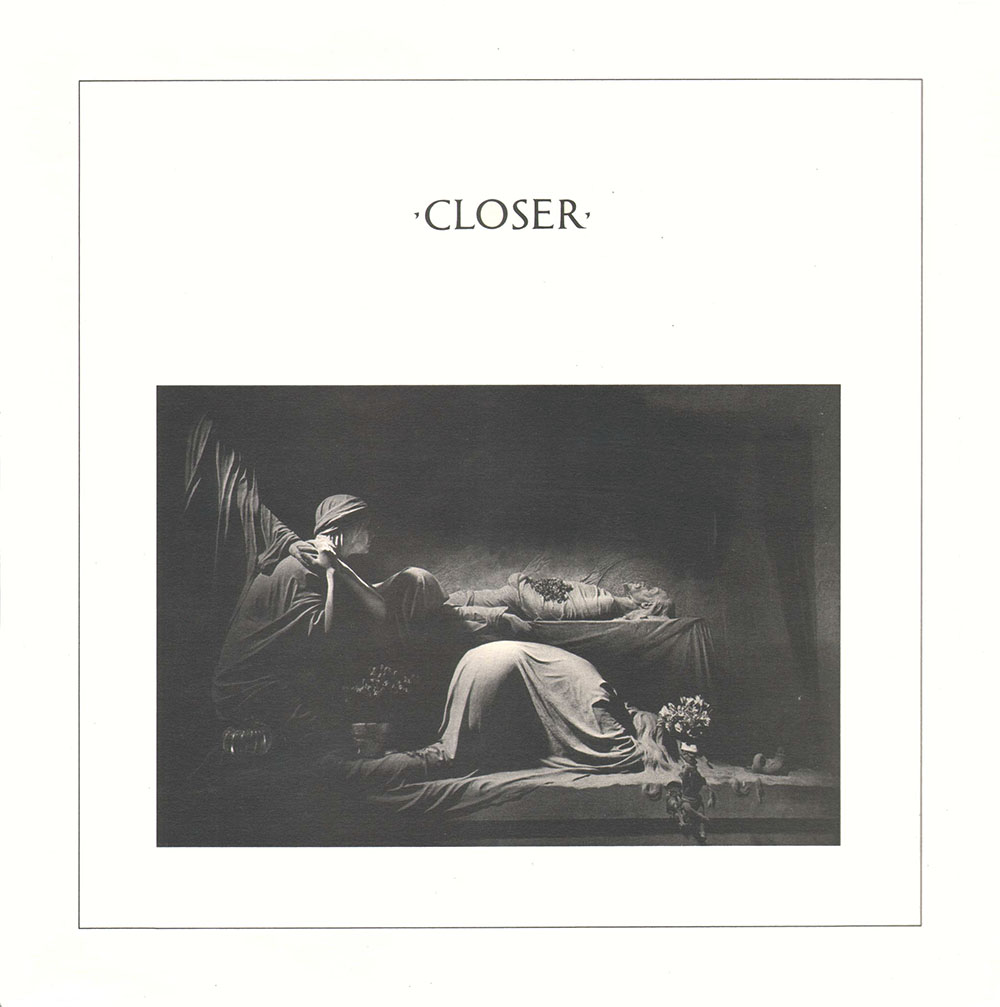
FACT 25, Closer, 18 Jun 1980
The sleeve for Love Will Tear Us Apart echoed the concept of a grave marker:
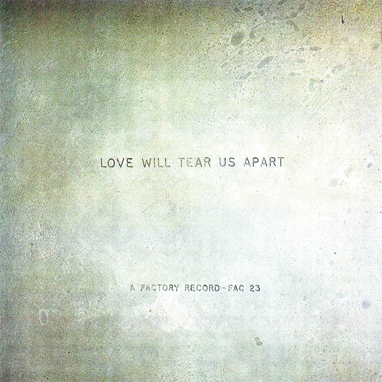
FAC 23, Love Will Tear Us Apart, 18 Apr 1980
The later 12" featured a Wolff photograph of the Ribaudo tomb from the same cemetery and was designed as the “negative” of Closer:
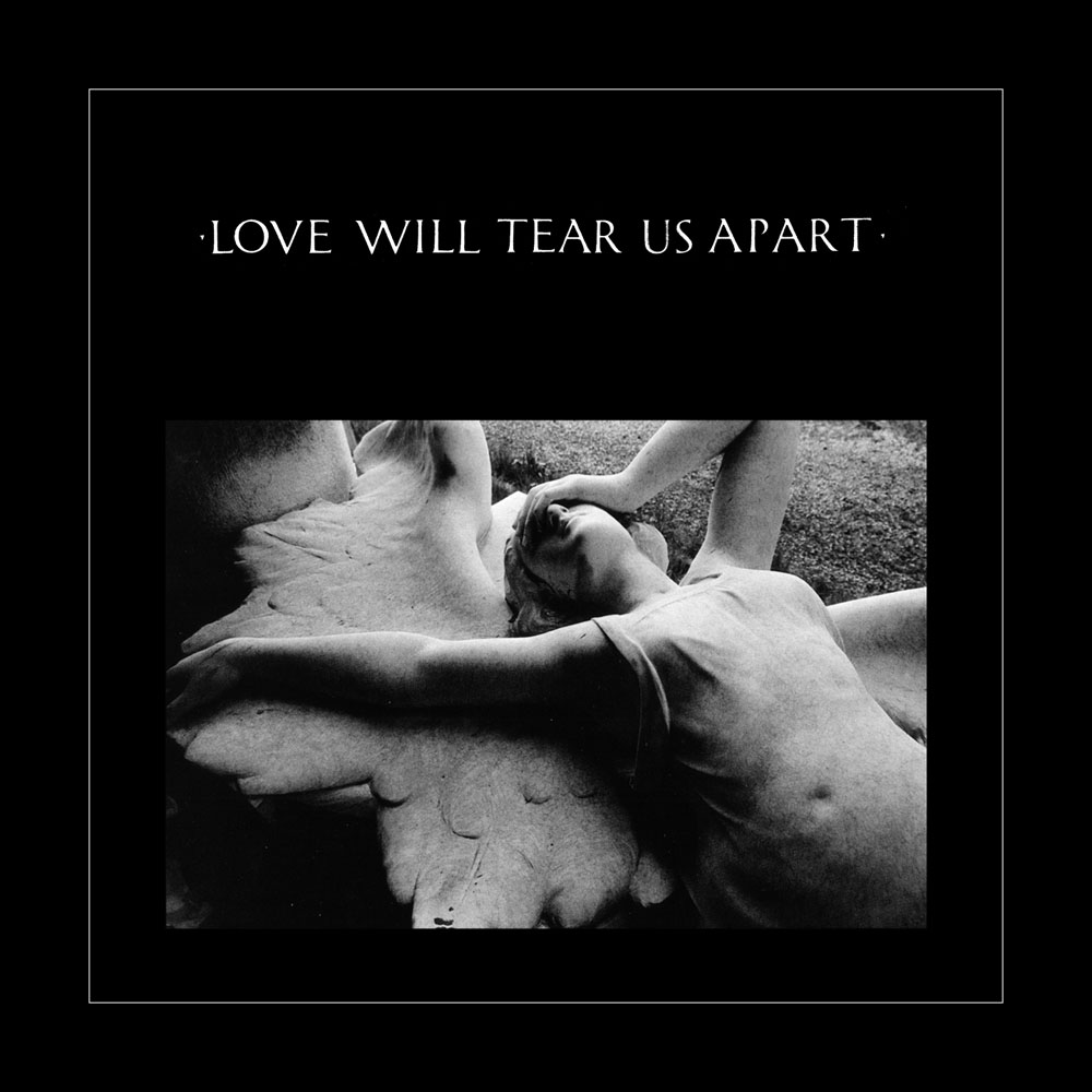
FAC 23, Love Will Tear Us Apart, 27 Jun 1980
After Ian’s death the remaining members of Joy Division regrouped as New Order. For their first single Saville continued the neoclassical theme using Berthold Wolpe's Albertus (the “Veritas hound” is directly from a 1937 type specimen). As he later said “ I wanted it to have the feel of a package purchased in a religious store:”

FAC 33, Ceremony, 6 Mar 1981

FAC 33, Ceremony, 6 Mar 1981
Reusing a detail from a type specimen is one thing but for Section 25’s Always Now Saville set the entire cover with a repurposed Bembo specimen from a Berthold type catalog.
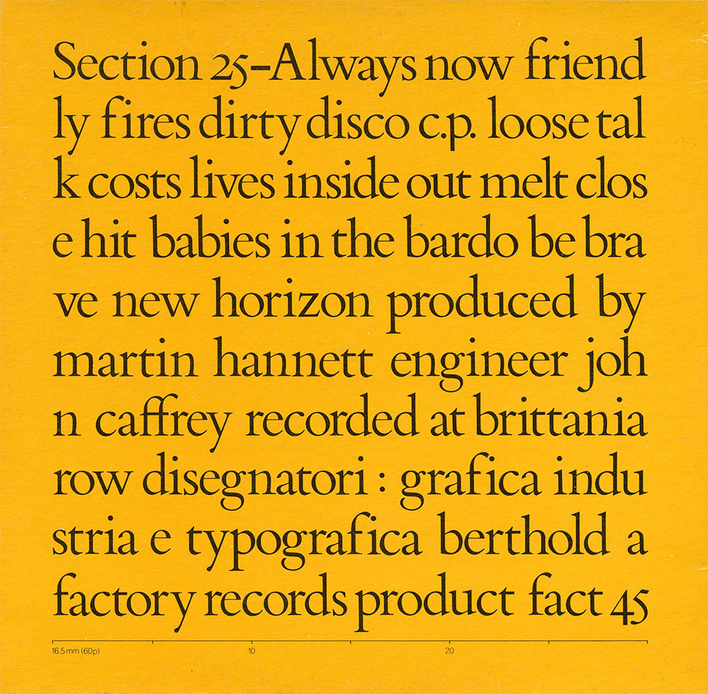
FACT 45, Always Now, Sep 1981. Quimby
For Joy Division’s posthumous release (named after a bootlegger’s still) Saville designed an extraordinarily minimalist cover entirely in Copperplate Gothic. Of course his minimalism didn’t exactly extend to the packaging – a thick hessian cloth book cover:
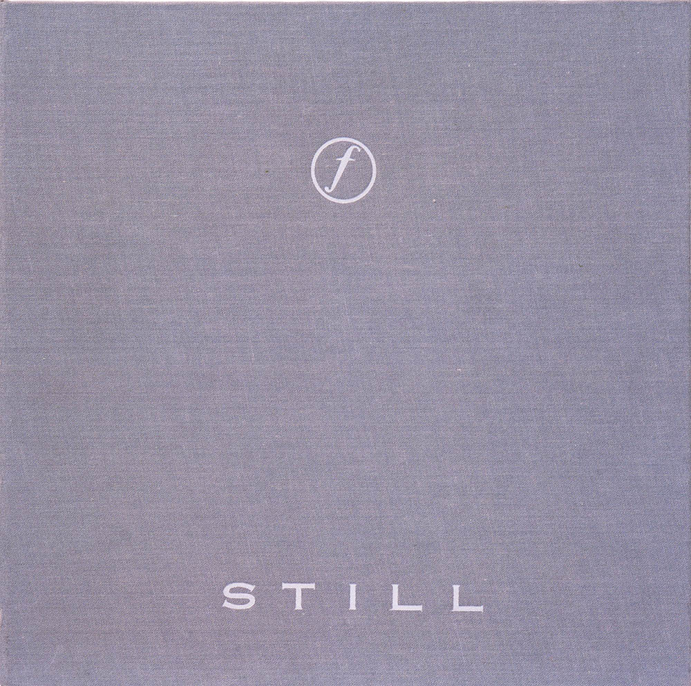
FACT 40, Still, 8 Oct 1981
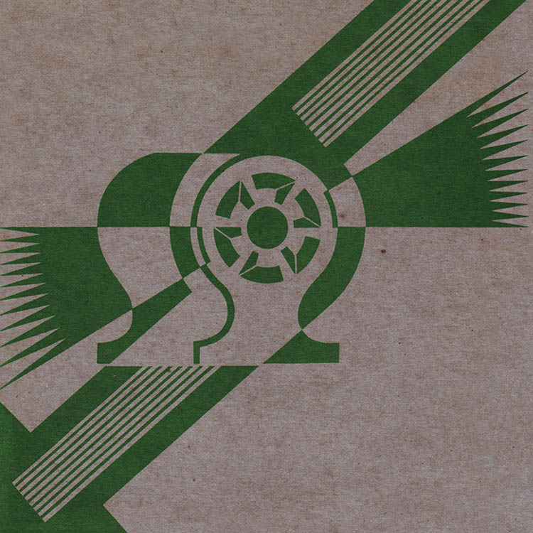
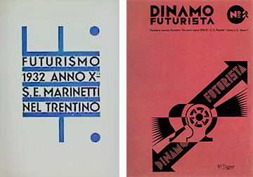
Having finally exhausted neoclassicism Saville turned his attention to Italian Futurism, designing for a few years under the moniker Graphica Industria. For New Order’s first album and next single (which was not from the album – a typical Factory move), he reused Depero Fortunato’s 1930s work for Futurismo:6
FAC 53, Procession, Sep 1981. This was one of nine different colorways printed.
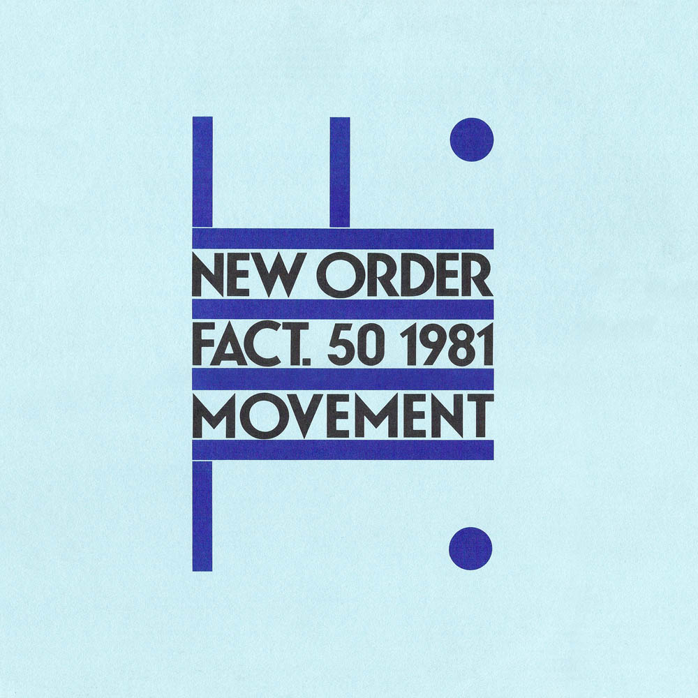
FACT 50, Movement, 13 Nov 1981
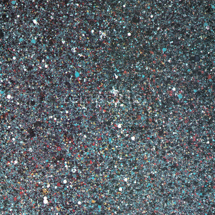
FAC 63, Temptation, 10 May 1982

FACTUS 8, New Order 1981–1982, Nov 1982
By 1983 Saville became interested in machine-readable alphabets and created a color-coded alphabet which he used on New Order’s next few releases. While the band was working on Blue Monday, Stephan Morris gave him a 5.25" floppy disc with sequencer data. He thought it was a “beautiful object” and designed a complex, expensive die-cut recreation for the cover. Although the band considered it “rather obvious” it would be one of the seminal cover designs of the 1980s.7
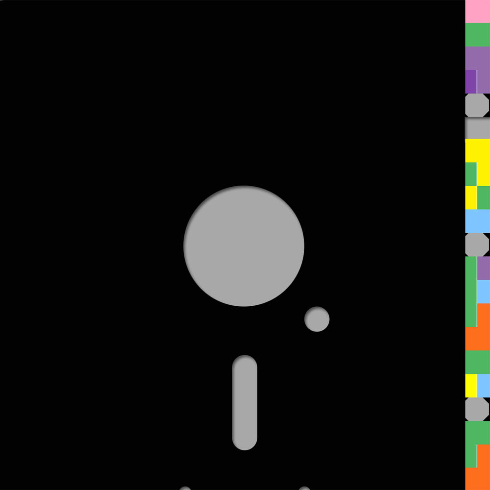
FAC 73, Blue Monday, 7 Mar 1983
For Power, Corruption and Lies Saville famously chose Henri Fantin-Latour’s 1890 “A Basket of Roses” and annotated it with his alphabet. It was perhaps the most unlikely image imaginable and would become another 1980s icon in cover design. To this day Saville considers it his best work.
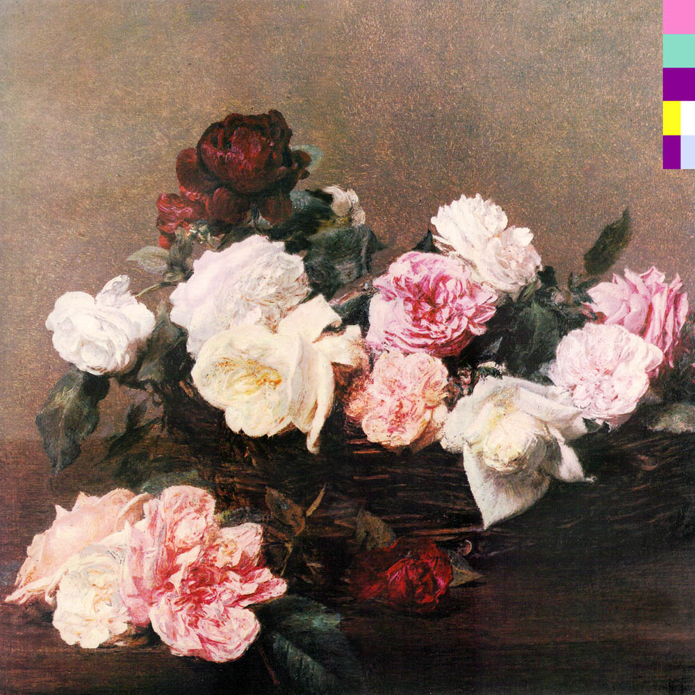
FACT 75, Power, Corruption and Lies, 2 May 1983
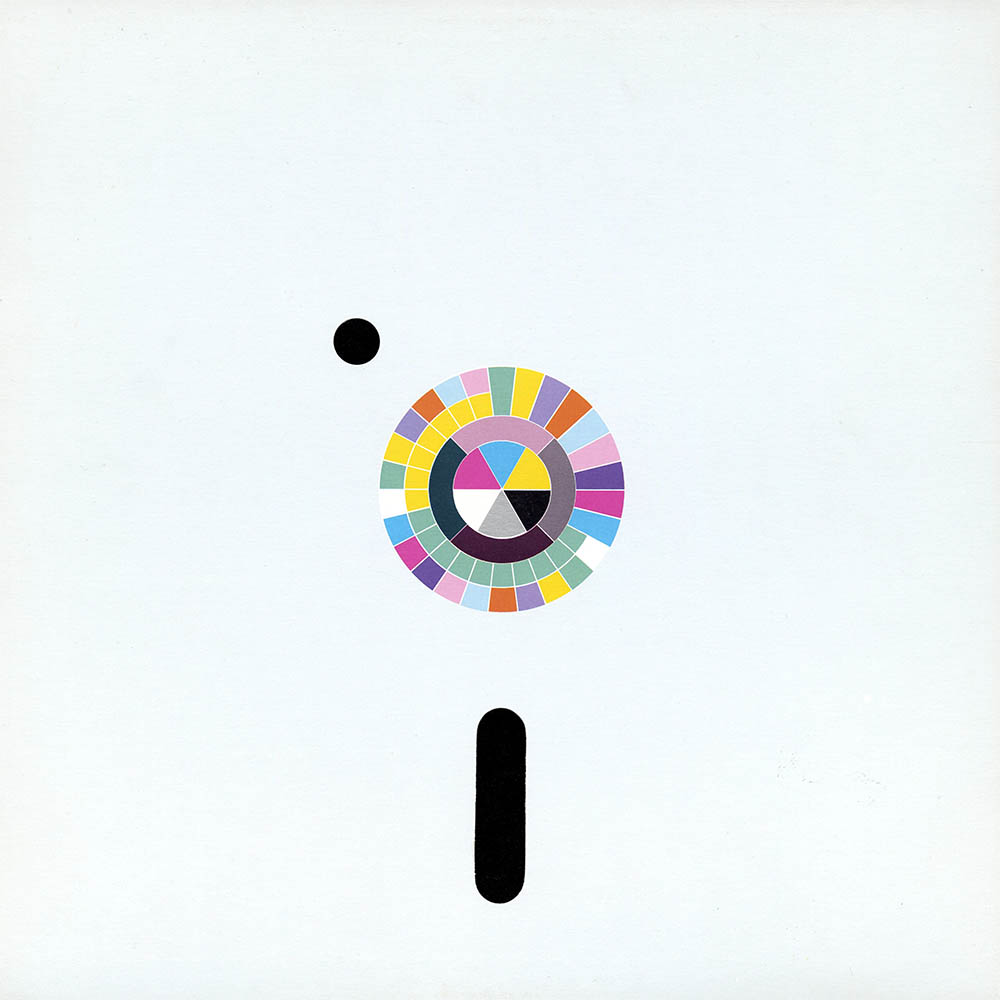
FACT 75, Back cover with the alphabet key8
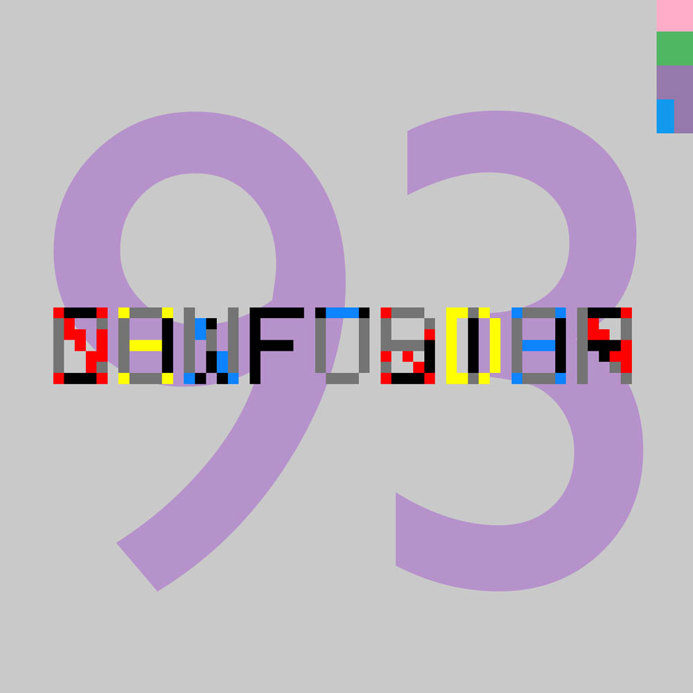
FAC 93, Confusion, Aug 1983
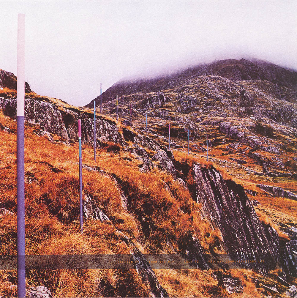
FAC 90, Section 25, From the Hip, Mar 1984. The stakes used the same color code
By 1984 Saville decided that New Orders next single would be his last piece of “straight historical referentialism.” He chose a reworking of Giorgio de Chirico’s The Evil Genius of a King and set it in a metaphysical-like grid of random numbers:
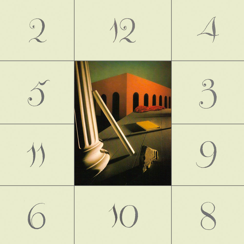
FACT 103, Thieves Like Us, 2 May 1983
On New Orders’s Low-Life Saville simply used Polaroid pictures of the band on the cover and inner sleeve – something that would have been unthinkable before. In one last nod to his “postmodernist layering of retrieved pieces” he surrounded the cover with a tracing paper overlay with the band name set in Stempel Neuzeit after Josef Müller-Brockman’s 1960 Der Film poster:
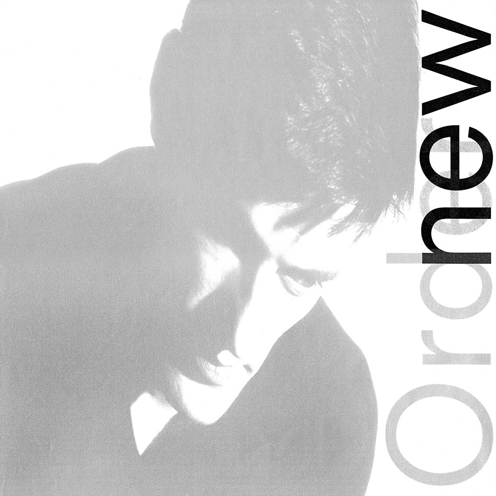
FACT 100, Low-Life, 13 May 1985

FACT 123, The Perfect Kiss, 13 May 1985
There were certainly seminal album covers (Kind of Blue, Sgt. Peppers, Sticky Fingers, e.g.) and star designers (Roger Dean, Storm Thorgerson) before Saville, but there has never been someone so self-referentially concerned with pure graphic design vs. decoration. His extravagant and lush packaging, both physically and conceptually, was unlike anything before or after. Over the course of several hundred covers Saville not only defined the look of Factory Records, but elevated the direction of cover art forever.
1. Wilson intended to catalog A Factory Sampler as FAC 1, but Saville argued that the poster, even though it was late, was the first Factory item. Thus began Factory’s bizarre, recursive and self-referential cataloging sequence. The last two Factory numbers allotted were FAC 501 for Tony Wilson’s coffin and FAC 511 for And You Forgotten, a memorial for Rob Gretton. For a complete list of Factory catalog numbers see Dennis Remmer’s venerable Factory Discography.
For a list of all Saville-designed record sleeves see the Japanese Sleeve Designed by Peter Saville. For more about Factory Records, Joy Division or New Order see Google, that’s what it’s there for.
2. Unless noted, The artwork was taken from Jeb Edwards New Order Recycle Project. Beyond the hi-res artwork, however, Jeb and his collaborators have remastered the entire Joy Division/New Order singles catalog and presented their results as 256 KB/s AAC files. It’s one of those internet projects that simply make you stop in place and say “whoa.”
3. For more about the influence of the cover see: Wozencroft, John. “Out of the Blue.“ Tate Etc. Summer 2007 (10), which is online.
4. Here are more current photographs of the tombs in the Cimitero monumentale di Staglieno. The image on the right is from Salvatore Petrantoni’s Flickr stream:
5. Which in an interesting twist of fate is your humble narrators birthday. On that same day Mount St. Helens erupted in Washington – it was the deadliest volcanic eruption in US history.
6. Here are the original Fortunato covers for reference. Sorry that I don’t have larger versions:
7. Blue Monday would become the best-selling 12" single ever, with the UK Singles Chart reporting sales over a million copies. Of course it never received gold disc status because Factory, true to form, never bothered joining the British Phonographic Industry Association.
8. So here we go. Reading the outermost segment and beginning with green segment at 12 o’clock the letters a–z are read clockwise. Starting again at 12 o’clock the numbers 1–9 are the double segments read clockwise.
10 Jun 2011, updated 11 Oct 2011 ‧ Design